
Form fields
Build clear, consistent and accessible fields across government services.
On this page
Form fields collect an answer or let someone make a choice. The component may change, but the surrounding rules stay consistent: give it a clear name, explain only what is necessary, preserve the answer, and show actionable feedback beside the field.
Use this foundation for shared field behaviour. Use the individual component pages for control-specific markup and APIs, the Forms pattern for structuring a complete form, and the Form implementation guide for handling state, submission and validation.
Choose the right component
| Need | Component |
|---|---|
| A short answer | Input |
| A longer answer | Input and text area |
| A small integer users may adjust | Number input |
| One choice from a short list | Radio |
| Any number of choices | Checkbox |
| One choice from a long, familiar list | Select |
| A memorable date | Date input |
| One answer made from several controls | Fieldset |
| A document or image | File upload |
Prefer the control that makes the valid answers easiest to understand. Do not make people type predictable choices, and do not hide a short list inside a select when radio buttons would let people compare it directly.
Anatomy
An ordinary field contains a form group, label, optional hint, optional error and the control. Keep this order consistent so people can scan and recover from errors quickly.
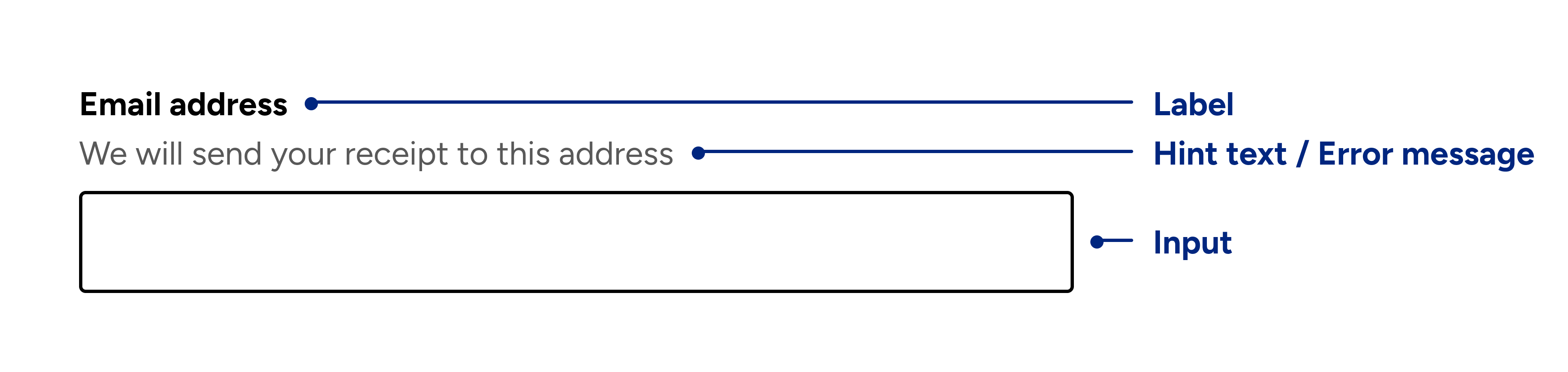
| Part | Purpose |
|---|---|
| Form group | Keeps the field and its supporting content together with consistent spacing. |
| Label or legend | States the question or expected answer. |
| Hint | Gives essential context, a format or a short example. |
| Error | Explains what needs to be corrected. |
| Control | Accepts the answer or selection. |
Groups of related controls use a fieldset and legend instead of one label. Each control inside the fieldset still needs its own label.
Labels
Give every field a visible label. Write it as a short noun phrase or direct question, such as “Email address” or “How should we contact you?”. Avoid instructions such as “Please enter” because the control already communicates the action.
Connect labels and controls explicitly with matching for and id values.
Radio and checkbox options each need their own label, while their shared
question belongs in the fieldset legend.
Only visually hide a label for an established compact control, such as search, where the purpose remains unambiguous. The accessible name must still be present.
Hint text and placeholders
Use hint text when the label alone cannot explain the format, why information
is needed, or where to find it. Keep it short and connect it to the control with
aria-describedby. Do not repeat the label or add guidance everyone already
knows.
Never use placeholder text instead of a label. It disappears after typing, looks like a prefilled answer, and is commonly rendered with weak contrast. If an example is important, put it in persistent hint text. See why we don’t use placeholder text for the full reasoning.
Width and layout
Inputs and text areas fill their available width. Constrain the surrounding layout to match the expected answer: a postcode should not appear as wide as a street address. Width is a visual hint, never a validation rule.
Stack fields vertically by default. Put fields side by side only when the relationship is familiar and the fields remain usable at narrow widths, such as day, month and year. Keep dependent fields immediately after the control that reveals or changes them.
Use the spacing foundation for page rhythm. Components own their internal spacing; do not add one-off margins between labels, hints, errors and controls.
Field states
| State | Guidance |
|---|---|
| Default | Ready for an answer. Do not prefill unless the service already knows the value. |
| Required | Treat fields as required by default and mark only exceptions as “optional”. Use native required only when it fits the validation flow. |
| Error | Keep the entered value, set aria-invalid="true", and connect a specific message with aria-describedby. |
| Disabled | Avoid when possible. Explain why a field is unavailable and what will enable it. Disabled values are not submitted. |
| Read-only | Use for a value people may need to review or copy but cannot change. Explain why it is fixed. |
Do not communicate a state using colour alone. Text, semantics and visible control treatment must agree.
Validation
Validate on the server even when client-side checks improve the experience. Run most validation when the form is submitted, not while someone is still typing. Immediate feedback is appropriate only when it clearly helps with a live requirement, such as reaching a password rule.
For each invalid answer:
- preserve the answer
- show an error summary at the top of the form
- link the summary item to the invalid control
- show a specific error beside the field without removing useful hint text
- set
aria-invalid="true"and connect the hint and error witharia-describedby
Write messages that state the correction, such as “Enter a date in the past”. Do not blame the person, apologize, or use vague text such as “Invalid value”. See the implementation guide for the complete submission and server-error flow.
Accessibility checklist
- Use native form controls and semantic attributes before adding ARIA.
- Give every control an accessible name and every group a legend.
- Keep instructions and errors available after people begin typing.
- Preserve values after validation fails.
- Keep keyboard focus visible and move it only when the next location is clear.
- Test with keyboard navigation, screen readers, zoom and autofill.
- Set useful
autocomplete,inputmodeand inputtypevalues.